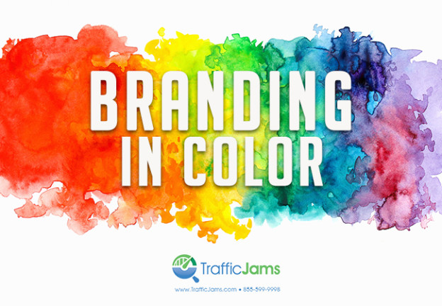
The first step to branding your business is deciding exactly what the message is that you want to convey. Once you’ve decided on the message you want to send and the emotions you want to evoke- the next step is deciding exactly how you’re going to do so. There are a large variety of ways to brand your business, all of which ultimately point back to your logo, website design, and product. With that being said, one of the most important and foundational components of branding is which colors you decide to use to brand your business. People see color before they have the chance to absorb anything else. Not so surprisingly, different colors evoke different emotions and yield different results of how people see brands.
In order to decide which colors you should use for your brand, you should look at what competitors’ use and then more closely look into each color and what it means.
Red: It’s fairly well-known that red activates the pituitary gland, which in turn increases heart rate. Red can evoke a response very passionate, though not always a good one. Red can represent danger or something negative, but given that it is used correctly it can also make people hungry or thirsty. A great example of proper use of red is McDonalds. They combine it with yellow so that people become hungry and joyous, as the combination of the two has proved to make people hungrier.
Orange: Orange stimulates enthusiasm, creativity, productivity, optimism, and happiness all while remaining less intense and fun as yellow. Lighter shades of orange have been proven to be associated with higher class products or services.
Pink: Depending on the intensity of the shade, pink can evoke a few different emotions. Hot pink typically conveys excitement and is best when used for cheaper products for women, whereas lighter pinks are more romantic or sentimental.
Green: Typically associated with health, freshness, or eco-friendliness, the color green’s meaning varies on its shade.
Yellow: Most people associate yellow with the sun, which means that yellow communications joy, optimism, and warmth. Specific shades of yellow motivate creative thought and energy. Yellow also makes a fantastic compliment to other colors, as it brings joy to the other emotions evoked and is the first color seen when next to others. This means that products or brands with yellow are more likely to be seen before others without the utilization of yellow.
Blue: The color blue is typically perceived as secure, dependable, liberal, and fiscally responsible. Additionally, it is associated with the sky and sea, meaning it is seen as serene and well-liked. Some companies that use blue as a brand include Facebook, Skype, Blue Cross Blue Shield
Purple: Purple is meant to evoke innovation, creativity, and is favored among people who think out of the box. Additionally, purple represents elegance and royalty.
Brown: With its rustic yet work look, brown is known as earthy and sturdy. A great use of brown in a logo is UPS, who shows that it’s reliable and strong.
White: The color white first and foremost represents purity, which is why it’s typically used for health-related products.
Black: Black is the most serious color, but is bold, powerful and represents sophistication and class.
Of course each color has a different meaning in different cultures, but these are the most common emotions evoked with each color. It’s very important to your brand that you test out different colors, and don’t just pick colors that you like but instead that truly represent your brand’s identity.
A website should always represent your brand correctly and relate to the colors within your logo. Web design is one of the most crucial factors in your on-page SEO ranking factors.
Need help creating a new or fresh logo and website? Start branding in color today, contact us at sales@trafficjams.com or by calling (855) 599-9998.
